Some of my color mixing videos went viral over the past year on social media. As a result, I receive a lot of questions about color wheels. Some of the comments are about how to use color wheels for mixing colors.
The interesting thing is that I don’t really rely on color wheels or recommend them very often.
Color wheels may help you to see the relationship between colors. They also help with thinking about colors in terms of warm versus cool colors. But as a color mixing guide they’re limited.
In this post, I discuss the reasons why color wheels aren’t that useful for mixing colors. If you’re having trouble mixing purple or brown this post will explain why that is.
But first, I need to cover some basic information about the different types of color wheels. Feel free to skip to the section you’re most interested in.
This post contains affiliate links that lead to Amazon and Blick Art Materials. This means that if you click on a link and make a purchase I earn a commission at no cost to you.
In my color mixing course (see below) I don’t even refer to a color wheel. I focus instead on using a limited palette of primary colors and demonstrate how to mix colors from them.
The best way to learn how to mix colors is to select a limited palette of colors and to practice mixing a wide range of colors from them. This is what I teach in my course. I cover all of the materials that I use including the colors, brushes, palettes, and palette knives.
You can use either student acrylics or professional acrylics. I do demonstrations with both.
In this course I teach the color mixing techniques that I use in my social media color matching videos. It's for beginners and advanced painters. It includes 60 minutes of video.
Table of Contents
What Is a Color Wheel?
A color wheel is an arrangement of colors on a circle that is divided into 12 sections. There are three primary colors spaced evenly apart. Mixing the primary colors together creates the secondary colors. The remaining spaces are filled in by mixing the primary colors with the secondary colors.
These are the tertiary colors. An example of a tertiary color is blue green that is between blue and green.
The concept of tertiary colors aren’t very useful in painting because the definition seems arbitrary. If you think about it, you can divide the steps between colors as much as you want.
Types of Color Wheels
There are color wheels for mixing paints. Photo editing and graphic arts programs also contain color wheels for selecting colors.
However, the primary colors for light are different than what artists use.
Additive color mixing is for light such as what you see on a computer screen, TV, or a phone. The basic idea is that you add the separate elements of light together and that creates white light.
Subtractive color mixing is for printing inks and paints. It’s the opposite of additive. You start with white light and then filter out parts of the spectrum to get to the color you want.
They work differently, so you can’t apply the rules of additive color mixing to painting.
For example, If you use a photo editing program you may notice that red and green makes yellow.
As a painter that may be surprising because mixing red paint with green paint will create brown.
What Color Wheel Do Painters Use?
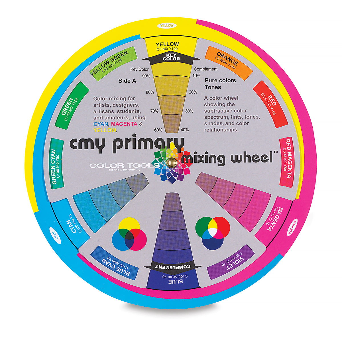
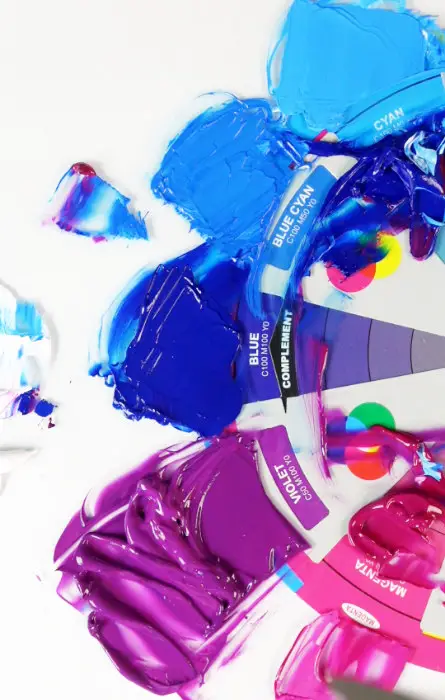
The color wheel that painters use is the one that uses red, yellow, and blue as primary colors. This may be the most popular color wheel, but it’s inaccurate. The cyan, magenta, and color wheel is a better representation of how subtractive color mixing works.
If you want you use a color wheel for painting, I would recommend looking at the CMY color wheel because it’s more accurate.
The main difference is that it uses magenta instead of red for a primary color.
Mixing Wheel – 7 3/4”, CMY Primary Mixing
from: Blick Art Materials
A primary color is a base color that you can’t mix from other colors. In other words, if you can mix a color, then it’s not a primary color.
Magenta works better for mixing purple and violet colors.
In another post I address the issue that red isn’t a primary color. You can mix it from Quinacridone Magenta and Hansa Yellow Opaque or any transparent yellow.
5 Reasons Why the Color Wheel Doesn’t Work for Color Mixing
Below are the five reasons why I believe that color wheels aren’t that useful for mixing colors. They have uses for seeing how colors relate to each other, but I don’t think they’re that useful for learning how to match colors accurately.
1 The Names of the Colors on the Color Wheel Are Generic
If you look at the names of the colors that are on the outside of the color wheel, they are very basic.
The problem is that a generic color name such as blue doesn’t really help you as an artist when there are so many colors to choose from.
When you walk into an art supply store and you’ll find over a hundred colors to choose from.
So when you are trying to figure out which colors you should use as primary colors, it can be confusing.
Just deciding upon which blue to use leaves you with a lot of choices.
Which Blue Is a Primary Color?
In the subtractive color model, cyan is the primary color. Phthalo Blue blue is basically the same pigment that’s used for cyan printing ink. Straight from the tube it may be too dark but you modify it by adding white or painting medium to it.
There are two shades of Phthalo Blue, red shade and green shade. It’s the green shade that is most popular and what I recommend.
Below is a list of some of the blue paints that are available to artists. It’s a compilation of colors that I found in the acrylic paints from Golden and Liquitex.
The same issue exists for the red and the yellow. Although you’ll want to use magenta instead of red for mixing purples and violets.
BLUE PAINTS
- Phthalo Blue (Red Shade)
- Phthalo Blue (Green Shade)
- Ultramarine Blue
- Cobalt Blue
- Cerulean Blue
- Anthraquinone Blue
- Prussian Blue
- Primary Blue
- Light Blue Permanent
- Manganese Blue
- Azurite Hue
- Brilliant Blue
2 The Primary Colors on the Color Wheel Are Often Wrong
There is some debate about which colors are the primary colors. However, my recommendations are based upon practical experience with mixing paints.
That’s the approach that I take in my videos, I just test out whatever the theory is and see if it works.
Sometimes these color wheels will use a dark blue for the primary blue, such as Ultramarine Blue.
Ultramarine Blue will work well for mixing purple if you use magenta instead of red. The limitation of Ultramarine Blue is when you try to mix a vibrant green from it. Mixing Ultramarine Blue with any yellow will create a dull green.
Whether or not this is a problem depends upon what you’re trying to accomplish. You can use this combination as a color mixing formula for the dull greens that you see in landscape paintings.
I use it as a shortcut because if you start with Phthalo Blue and mix it with yellow, it creates a vivid green. Then you’ll have to add red or magenta to make it duller. Starting with Ultramarine Blue saves time.
The issue here is that Ultramarine isn’t really the best choice for a primary color.
Whenever I mention that I think magenta is a primary color in my videos, someone always comments that you can mix magenta from blue and red. Or that red and blue makes purple and they refer to the color wheel.
That seems like common knowledge but is it true?
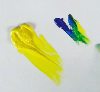
Red and Blue Makes What Color?
When mixing colors with paint, red and blue doesn’t make purple. What you get when you mix red and blue paint is either a brown or a dull grayish purple. It depends upon how much of each color you add.
If you add a small amount of blue to red, it creates brown. Adding more blue will make it turn more dull. Starting with blue and adding a small amount of red will make the blue darker and duller.
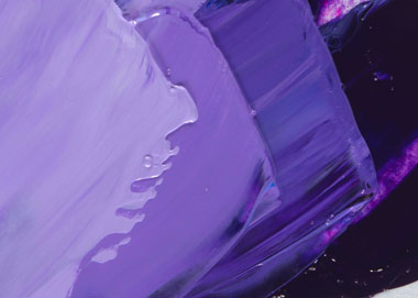
I demonstrate this in the video, and I include a photo below. I start with the same shades of blue and red that are on the color wheel.
Next, I mix them together to see if I they match what is on the color wheel.
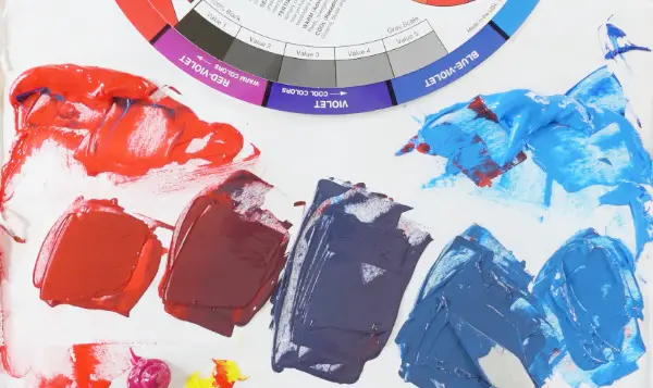
The range of colors you can mix from red and blue in the above photo are dull and not very vivid. They don’t line up with what you see on the traditional color wheel that uses red, yellow, and blue.
A lot of beginners feel frustration from trying to mix purple from red and blue. You can’t get a vibrant purple from it. The problem is with the red.
Here’s a link to another post where I demonstrate how to mix vibrant purple in another post. It includes recipes for mixing a purple that’s close to Dioxazine Purple, light purple etc.
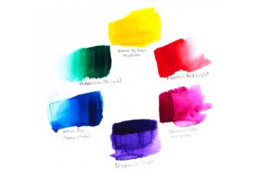
Below is an example of the purples you can mix from Phthalo Blue and Quinacridone Magenta. This creates much more vivid purples and violets.
The color wheel in the photo below is the CMY color wheel and the colors you can mix from it are close to what you see on the wheel.
Red Isn’t a Primary Color
As I said at the beginning of this post, red isn’t a primary color. That’s why it doesn’t work so well for mixing purple.
The idea that red is a primary color is something that is still taught in school and in books. This is what causes a lot of confusion when you try to mix colors.
I should make it clear that even though I can mix red, I do have tubes of red because it’s more opaque and a little more saturated than the red that you can mix.
This is useful for covering over mistakes.
Also, most of the secondary colors that you mix aren’t as vivid as the ones you buy in a tube.
For example, you can’t mix an orange that’s as vibrant as cadmium orange. While you can mix turquoise from Phthalo Blue, yellow, and white, it will never be as vibrant as cobalt teal.
So even though I can mix red I still buy Pyrrole Red for those reasons. Plus it’s just easier and faster.
3 Tinting Strength Is Not a Part of the Color Wheel
Mixing colors can be somewhat counterintuitive. When you look at the secondary colors you might assume you should mix the primary colors in equal amounts.
However, the tinting strength of the pigments has a large effect upon the amount of each color you use.
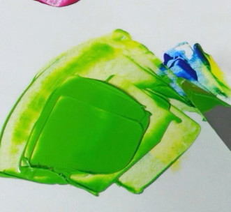
Tinting strength is a pigments ability to affect a color mixture. The most common example of a pigment that has high tinting strength is Phthalo Blue.
Some artist doesn’t like using Phthalo Blue because it can easily overpower the other colors in the painting. This isn’t an issue if you know how to neutralize colors, more on that later.
So if you want to mix a green you may think that you need to mix yellow and Phthalo Blue in equal proportions. That will result in a very dark blue green. You only need to add a very small amount of Phthalo Blue to the yellow to make green.
I demonstrate this effect in my color mixing course. Below is a still frame from my course where I mix a small amount of blue with the yellow.
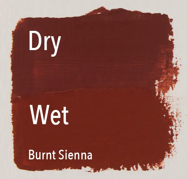
4 Color Wheels Don’t Account for Masstone or Undertone
Masstone is how a color looks in a thick layer. Undertone is how it looks when you apply it in a thin layer. Color wheels don’t show this effect.
For example, Phthalo Blue is very dark when you squeeze it out from the tube.
In one of my color mixing demonstrations, I try to mix the colors on the purple side of the CMY color wheel. When I squeeze out the Phthalo Blue, it almost looks like Ultramarine Blue. That’s how dark it is.
The picture of the CMY color wheel near the top of this post has a pile of Phthalo Blue on top of the cyan part of the color wheel.
But if you were to apply a glaze of Phthalo Blue, it would look lighter and much more saturated. That’s the undertone.
Most color wheels only show one or the other. They don’t show you how color looks when you apply it in a thick manner and in a thin glaze.
That may not be a big deal, but this is something that you should keep in mind when you’re working on a painting.
The reason why watercolor paintings look so brilliant is because the paints are transparent. When you paint with watercolors you have to add a lot of water to it to dilute it and make it flow. You never really apply it in a thick manner.
That’s why you don’t see the masstone of watercolor paints in a watercolor painting very often.
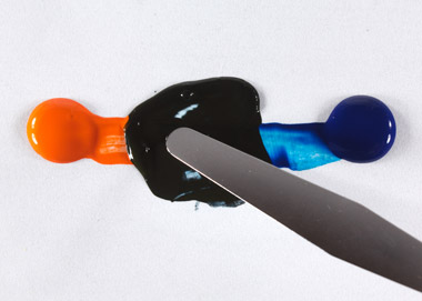
5 Color Wheels Don’t Show You How to Neutralize Colors
To neutralize a color means to make it less vibrant. While it’s fun to use colors full strength, most of the time you need colors that are a little duller that what you see on the color wheel.
Complimentary colors are the colors that are opposite of each other on the wheel. Ideally, these would be exact mixing compliments so they would create gray when you mix them together.
Unfortunately, it doesn’t really work out that neatly with paints.
There are mixing compliments that will create a gray or near black when you mix them together. Ultramarine Blue and burnt umber are one example of this. But mixing compliments are different than visual complements.
In other words, it seems like it’s nearly impossible to create a color wheel that has the mixing complement across from each other and have them also be the visual compliments.
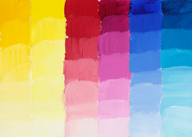
The colors on a color wheel are all very vibrant. In the real world, colors are usually much more neutral.
I bet if you look at your current surroundings, most of the colors aren’t that vivid. There are a lot of neutrals such as grays, browns or other dull colors.
Even if you paint in a purely abstract style, it helps to incorporate duller neutrals into the painting. This will help the vivid colors to stand out even more.
When all of the colors in a painting are vivid, nothing stands out. I talk more about this in the following post about How to Make Acrylics Look More Vibrant. In that post, I also discuss which pigments are the most vivid and the other factors that influence vibrancy.
Anyway, it’s important to be able to dull colors down when necessary. It helps to develop the ability to know how to make a color less saturated so that it becomes intuitive.
Learn How to Mix Colors
If the color wheel isn’t that great as a color mixing guide, then what do I recommend instead?
My top recommendation is to use a limited color palette and practice mixing a lot of colors. I also have a color mixing chart that you may find useful if you’re a beginner. I discuss this more in the last section.
If you do want to use a color wheel, I recommend the CMY color wheel because it has magenta as a primary color.
Practice Mixing Colors With a Limited Palette
The best way to learn how to mix colors is to select a limited palette of colors and practice matching a lot of colors with them.
This is what I teach in my color mixing course. The first few exercises use only three colors plus white to match colors. You can’t match every single color from them, but you can match quite a lot.
The benefit of using a limited palette is that you get really familiar with them and how they interact with each other.
This approach is much better than having 20 colors on your palette and not know how they behave when you mix them with each other.
Another benefit of using a limited palette is that it simplifies your decisions. There are only so many colors to choose from.
If you have to guess as to what color to add, there’s a let fewer choices so you’re more likely to get it right.
A Free Color Mixing Chart With the Names of the Colors
Other than color wheels, sometimes beginners are looking for color mixing charts. These are charts that have formulas for mixing certain colors. It’s like a recipe book for colors.
I have an acrylic color mixing chart with the names of the colors that you need to mix.
Some color mixing charts have the same problem that color wheels have-they use generic color names. This means you have to guess at which pigments you need to use to achieve the same result.
My chart also keeps the mixtures limited to using only two colors. This is because it’s easier this way. The more colors you add to a mixture, the more complex the process becomes.
When you only mix two colors together, then it’s just a matter of adjusting the proportions between the two.
Another question that people ask about formulas is there some way to measure the colors.
In the printing industry they use scales to a weigh each color when mixing custom ink colors. But this isn’t practical in painting. Each painting requires hundreds of colors and you don’t have the time to look up each color and weigh out each addition of paint.
I’ve also seen books that have recipes that measure colors by volume. The problem with this is that colors aren’t consistent across brands. Additionally, you don’t have time to look up each color as you need them.
Final Thoughts
The only way that you can get good at mixing colors is to practice. You’ll make some mistakes along the way but that’s just part of the process.
There’s no reason that you have he learn through trial and error. That’s the slowest way to learn. What you need is some basic information that’s based upon how paints actually behave when you mix them together and put it into practice.